Lobo Andino – Dry Gin Chileno
Santiago, Chile
A gin that pays homage to the culpeo fox
The project
Lobo Andino is a Chilean gin that pays homage to the Culpeo fox (Lycalopex culpaeus), a symbol of cunning and freedom in the Andes Mountains. This gin is made with selected botanicals for a unique and authentic experience.
The goal
The objective with this work was to highlight the culpeo fox or lobo andino, and to have a visual element that identifies the brand through typographic combinations, illustrations and colors. In this way, we sought to create an attractive visual identity and an emotional connection with the history and values of the brand.
Services
Differentiation strategy
Brand positioning
Visual identity design
Label design

The process
What the design was like before
The following label helped kick-start the brand. Although it met the objectives of the first stage, a change in the visual became necessary to achieve a new brand positioning. To achieve this,we first worked with the client developing different brand strategy sessions to lay the groundwork and then move on to the brand redesign stage.
Brand strategy sessions
In the strategy sessions we develop, research and analyze the purpose of the brand, the target market, who are the potential consumers and what are their buying habits. We also study the visual language of competitors to differentiate and stand out from the color, typographies, materials, printing processes, etc.
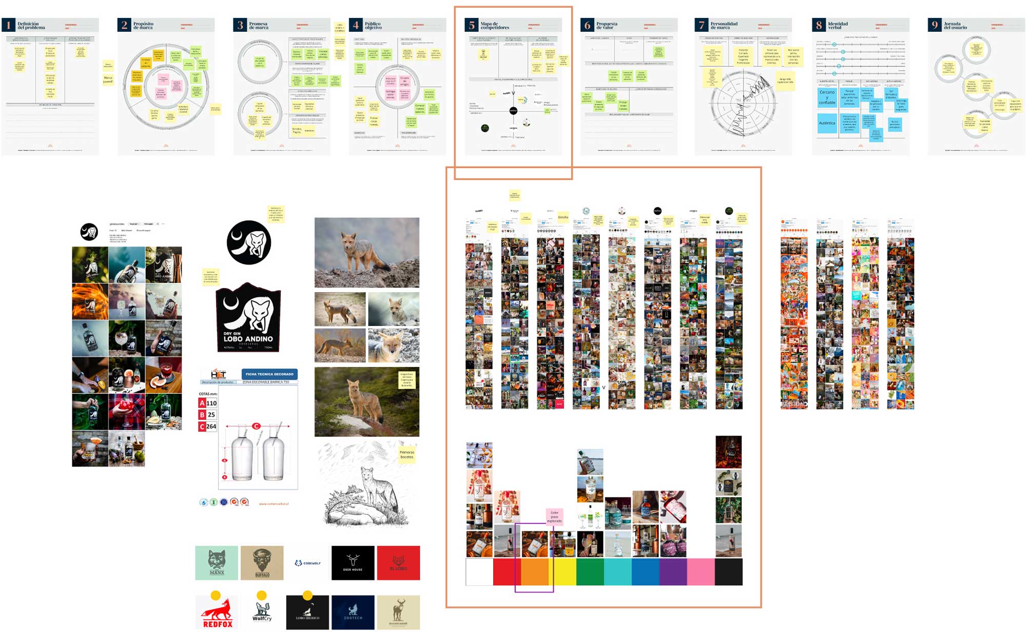
Strategy is very important to make informed decisions. Without it, everything that is done will be weak. That is why when a project is planned, studied and executed strategically, the objectives are successfully achieved, the results are positive and future mistakes are fewer.
Reference images
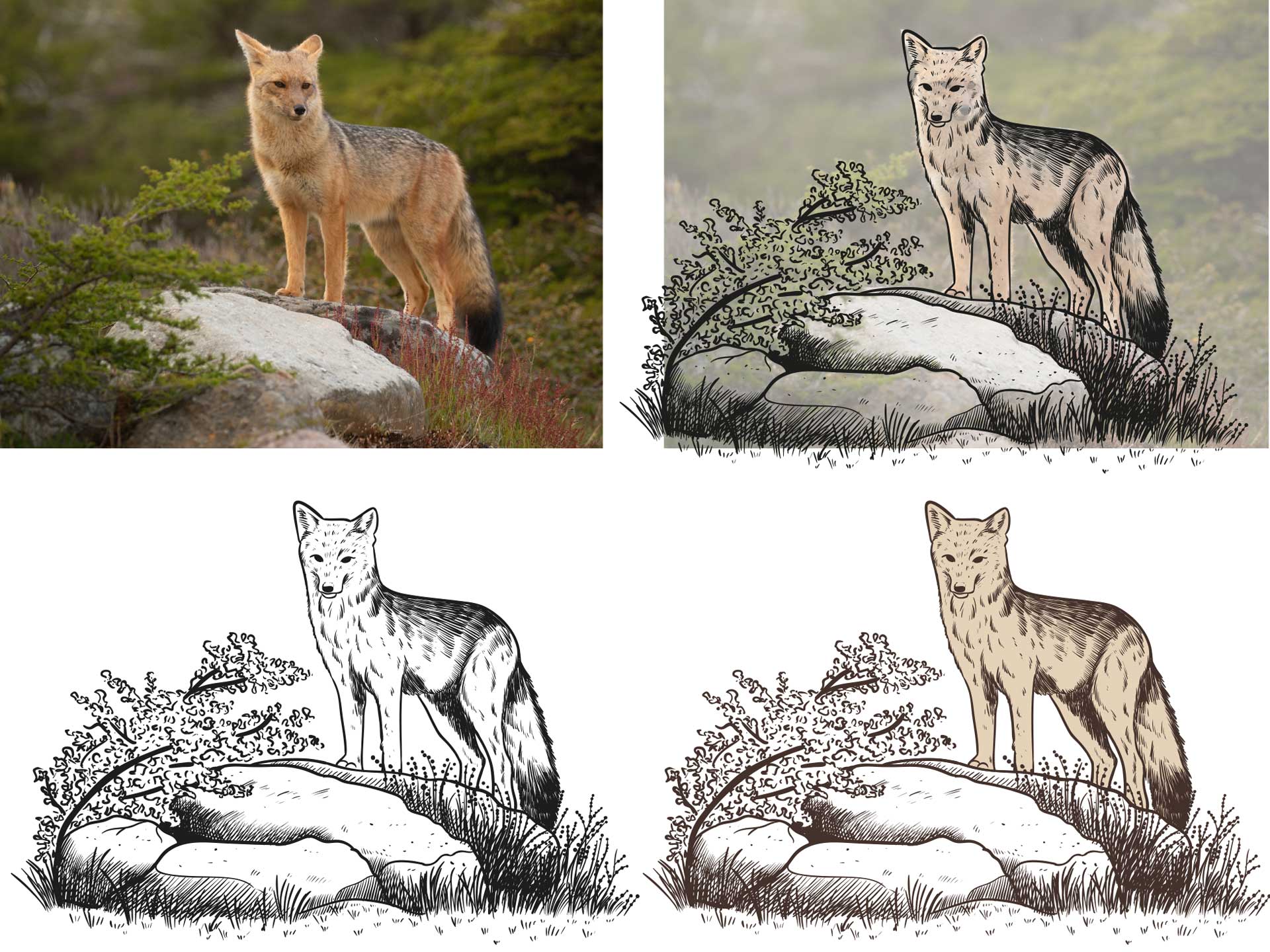
After an exhaustive analysis in the brand strategy sessions, three elements of great importance for the redesign of the brand were identified. These are the mountains of Santiago, the culpeo fox or lobo andino and the vegetation characteristic of this animal’s habitat.


Illustrations
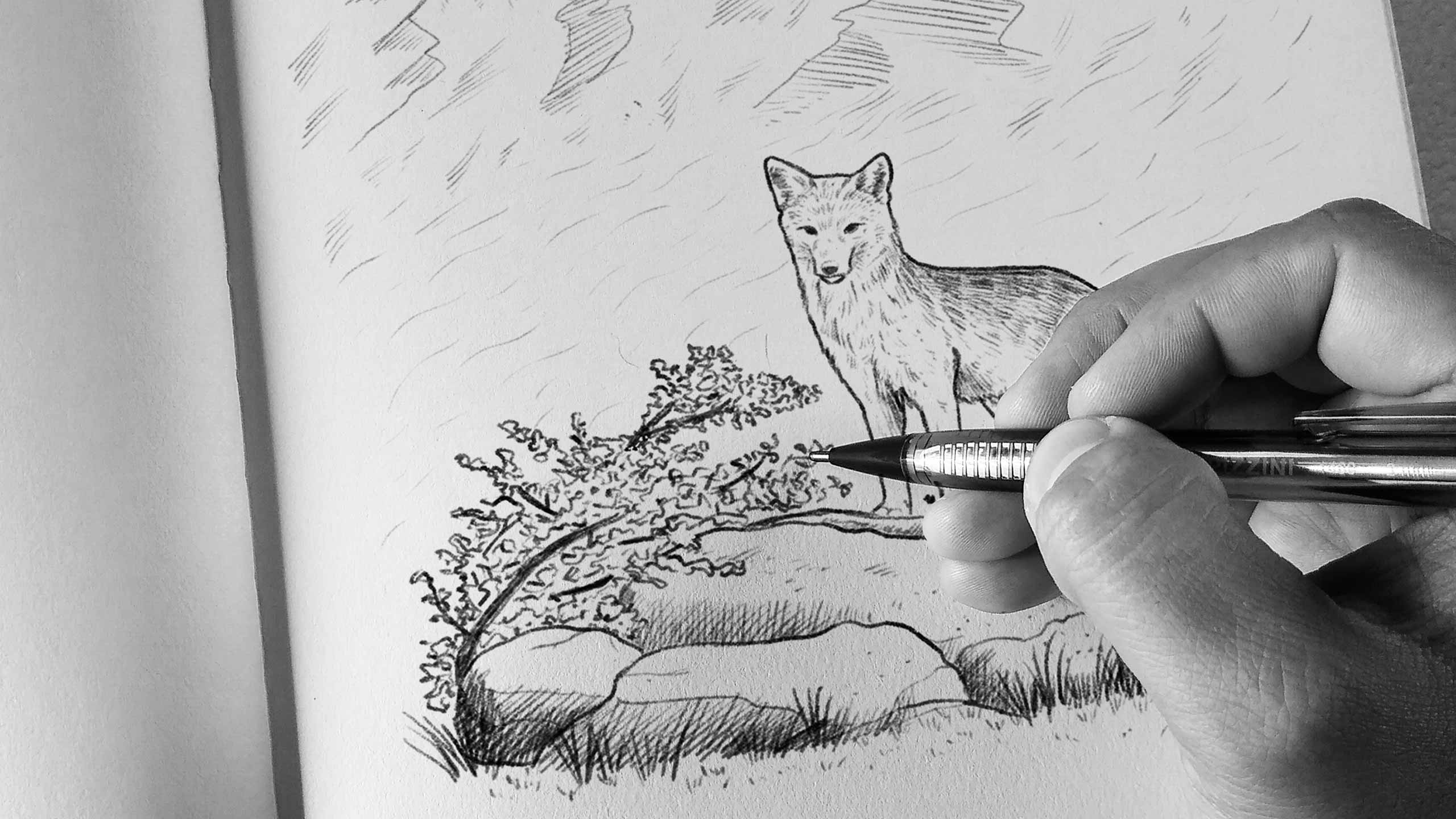
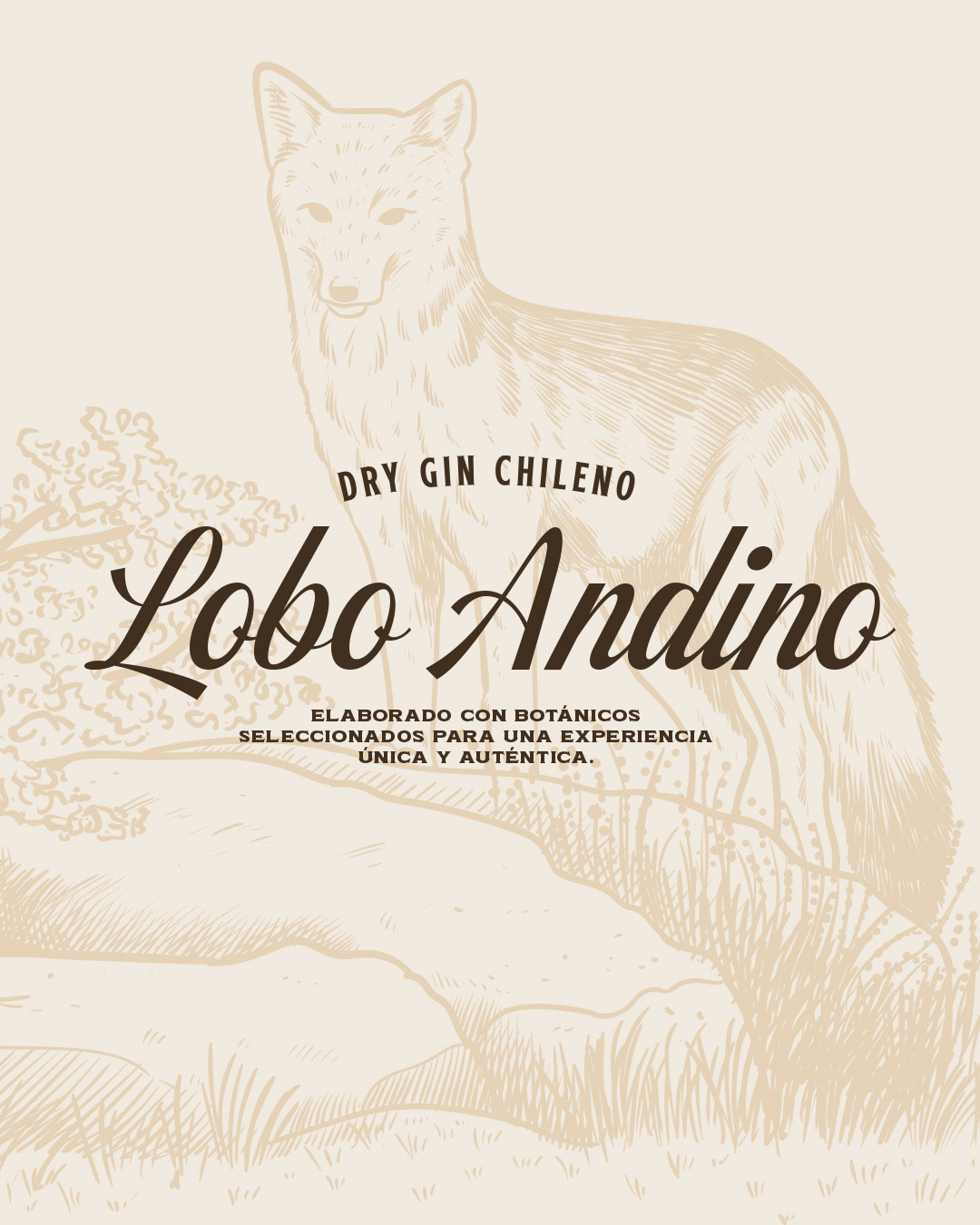
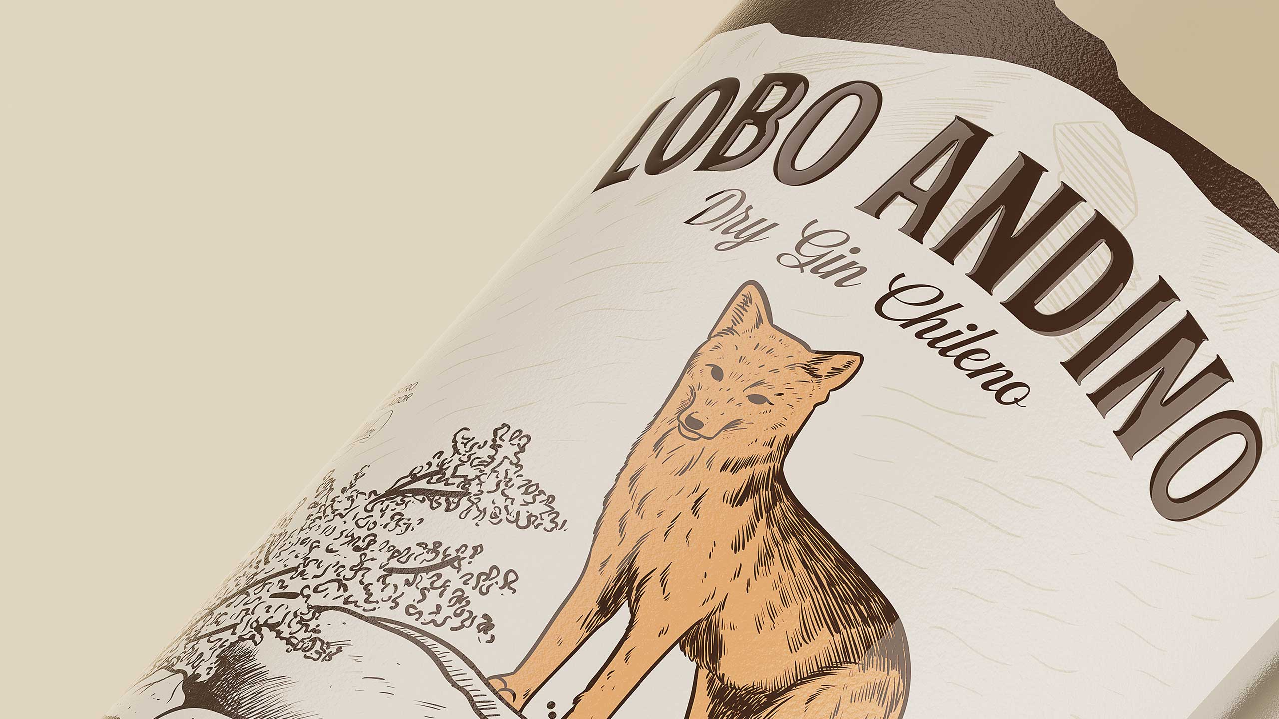
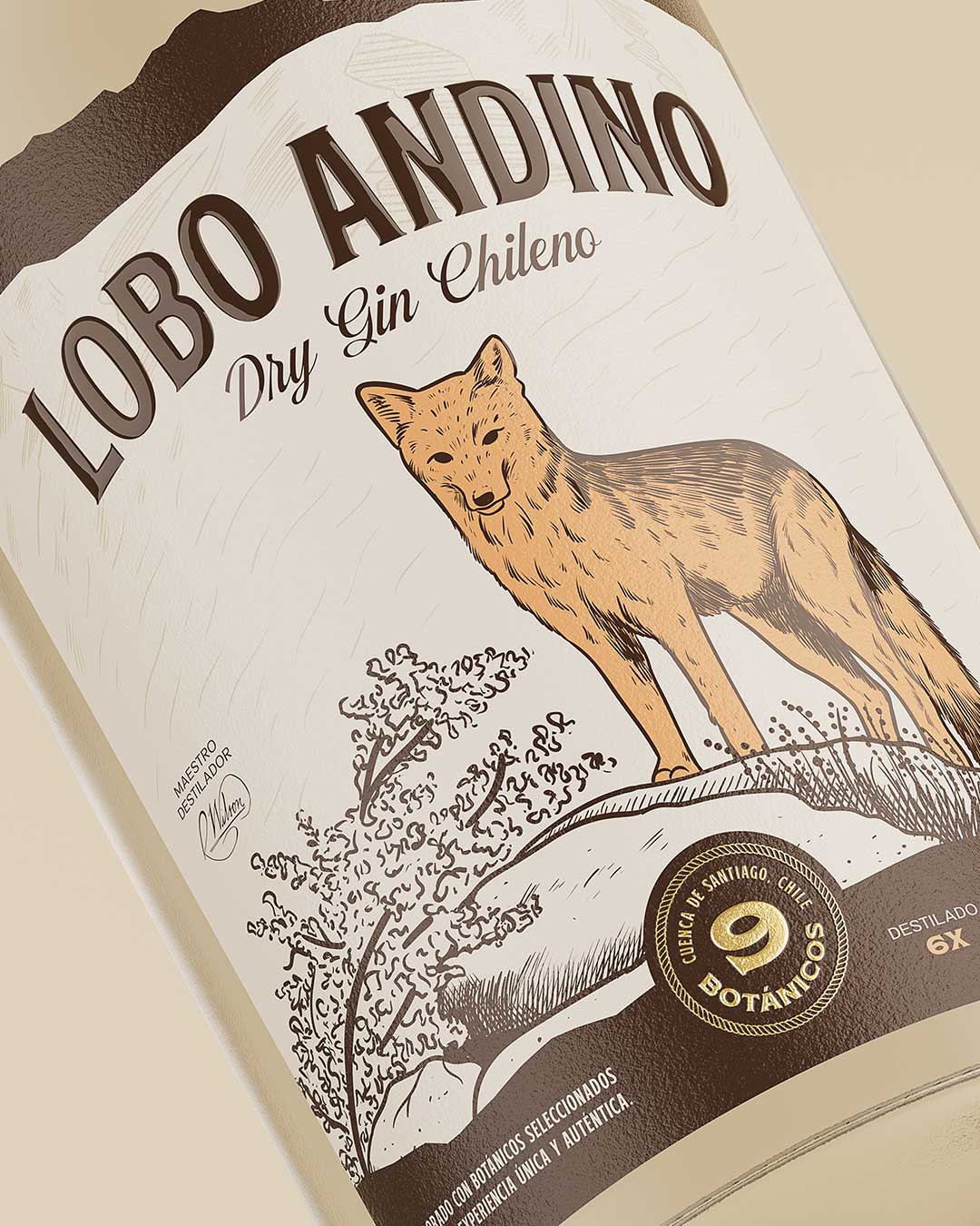
When creating the brand illustrations, the digital crosshatching technique was used to create a unique and distinctive visual effect on the label. This technique is generated by superimposing multiple lines in different directions to create shadows and textures in the images.
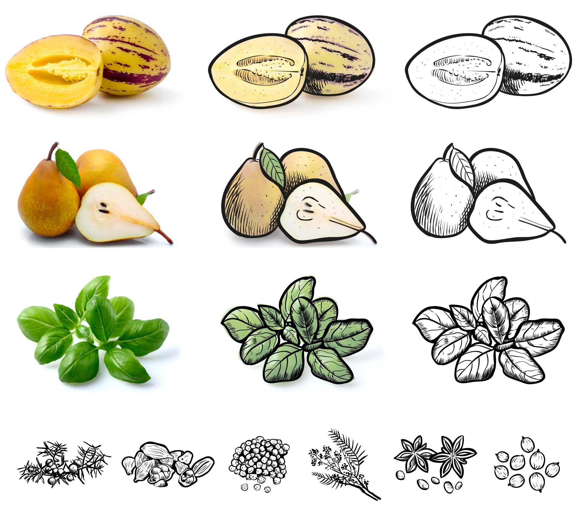
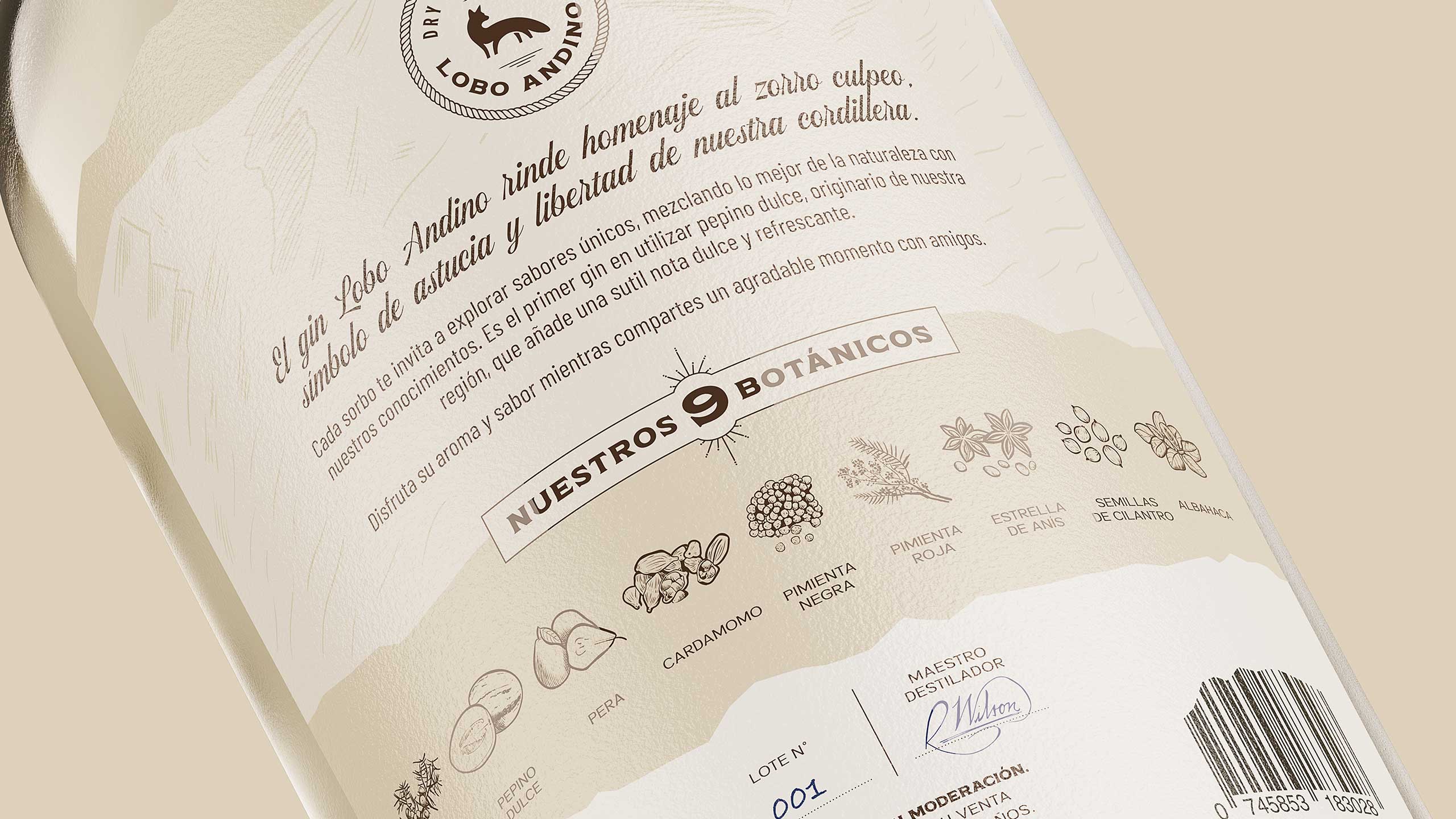
The illustrations of the 9 botanicals of the gin were also developed with the same technique to maintain consistency in the visual identity of the brand.
Visual Identity Design
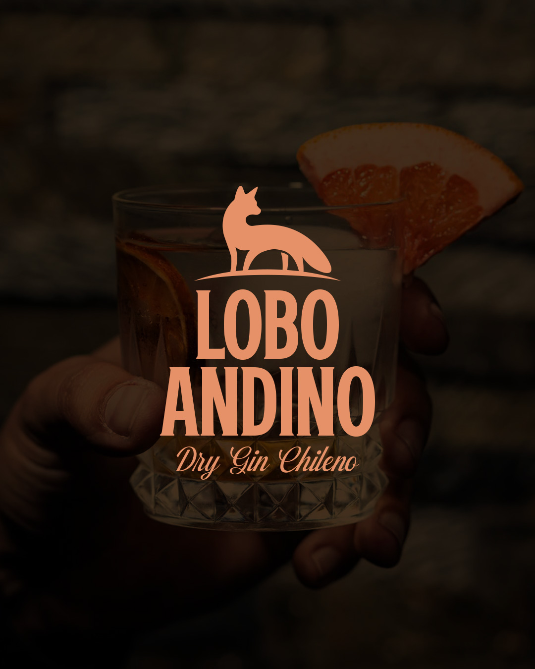
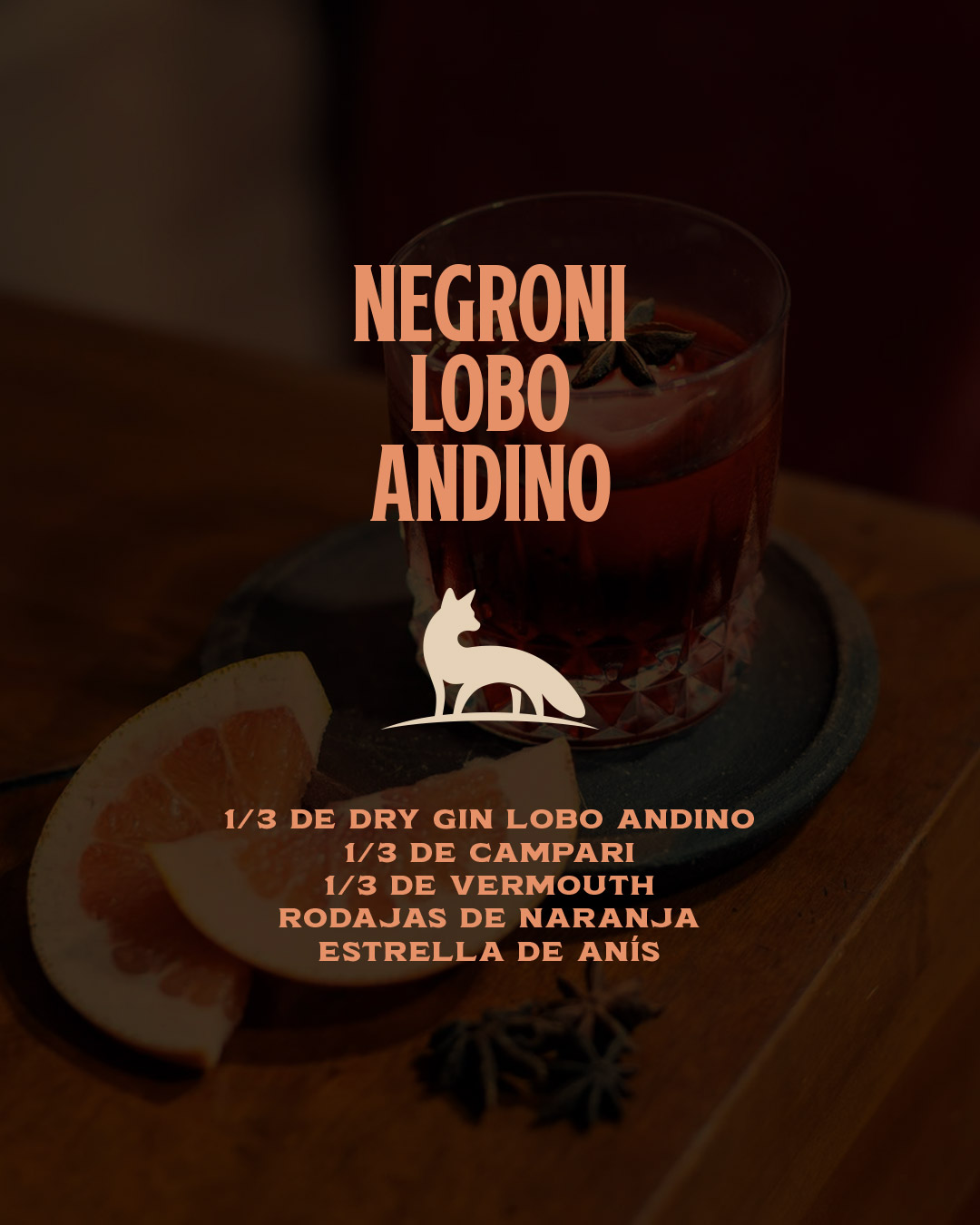
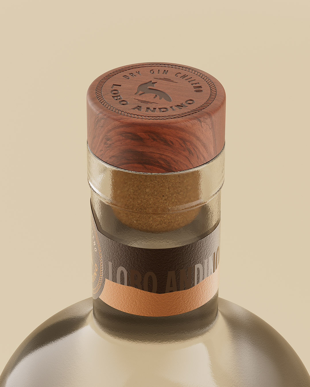
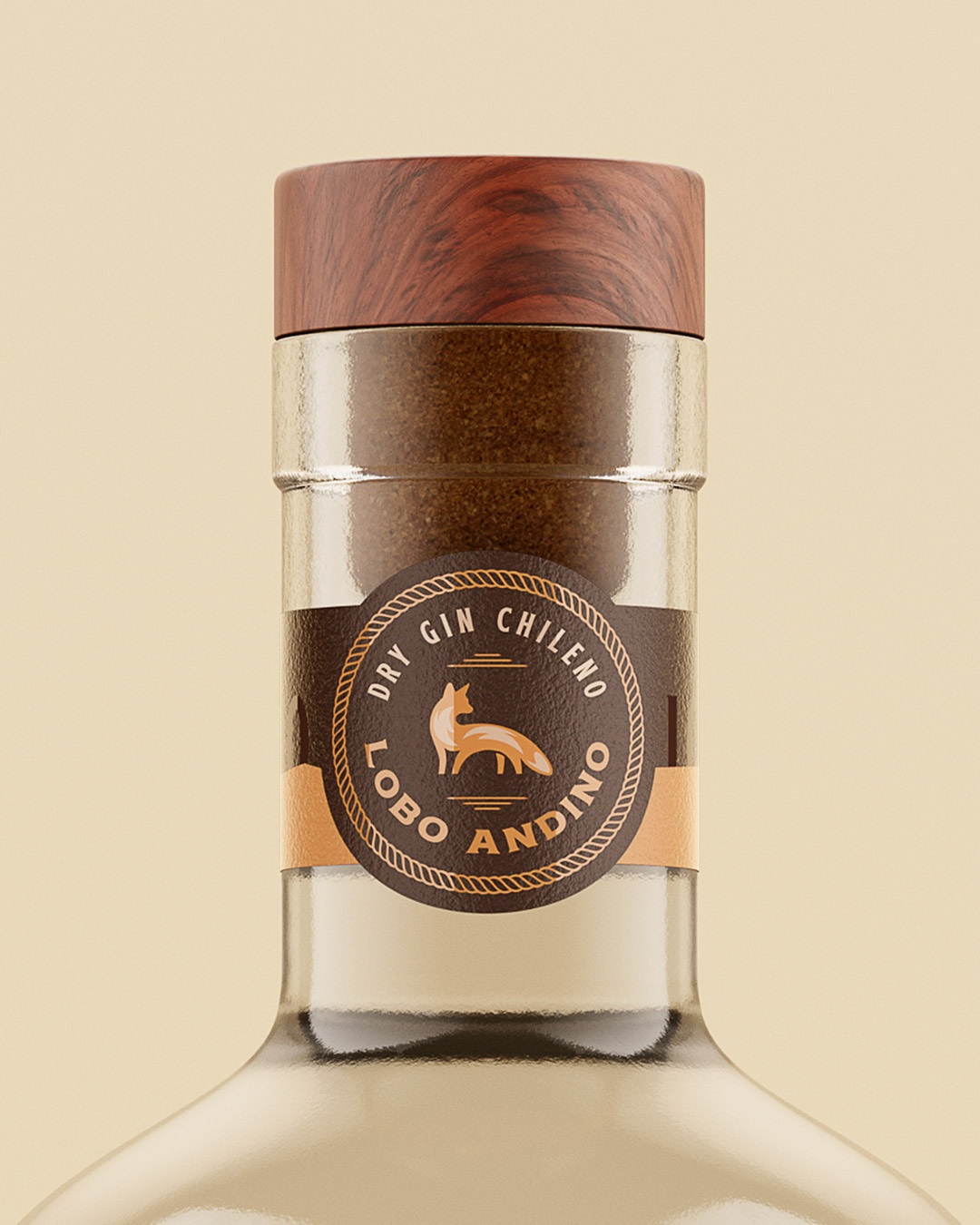
To achieve a consistent visual image, multiple versions of logos were designed with a vintage style of fonts and colors. Thus, they can be used in different brand applications, such as the gin label, social networks and brand communication.
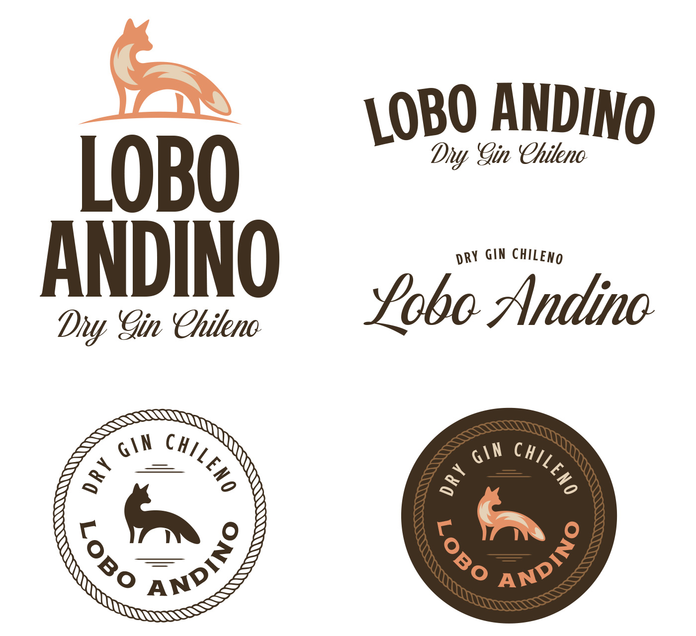
Regarding the choice of colors, we opted for tones that merge the colors of the culpeo fox and the mountains of Santiago, Chile. This choice generates a visually attractive and distinctive image, which differs from the colors used by other brands in the local market.


Label design
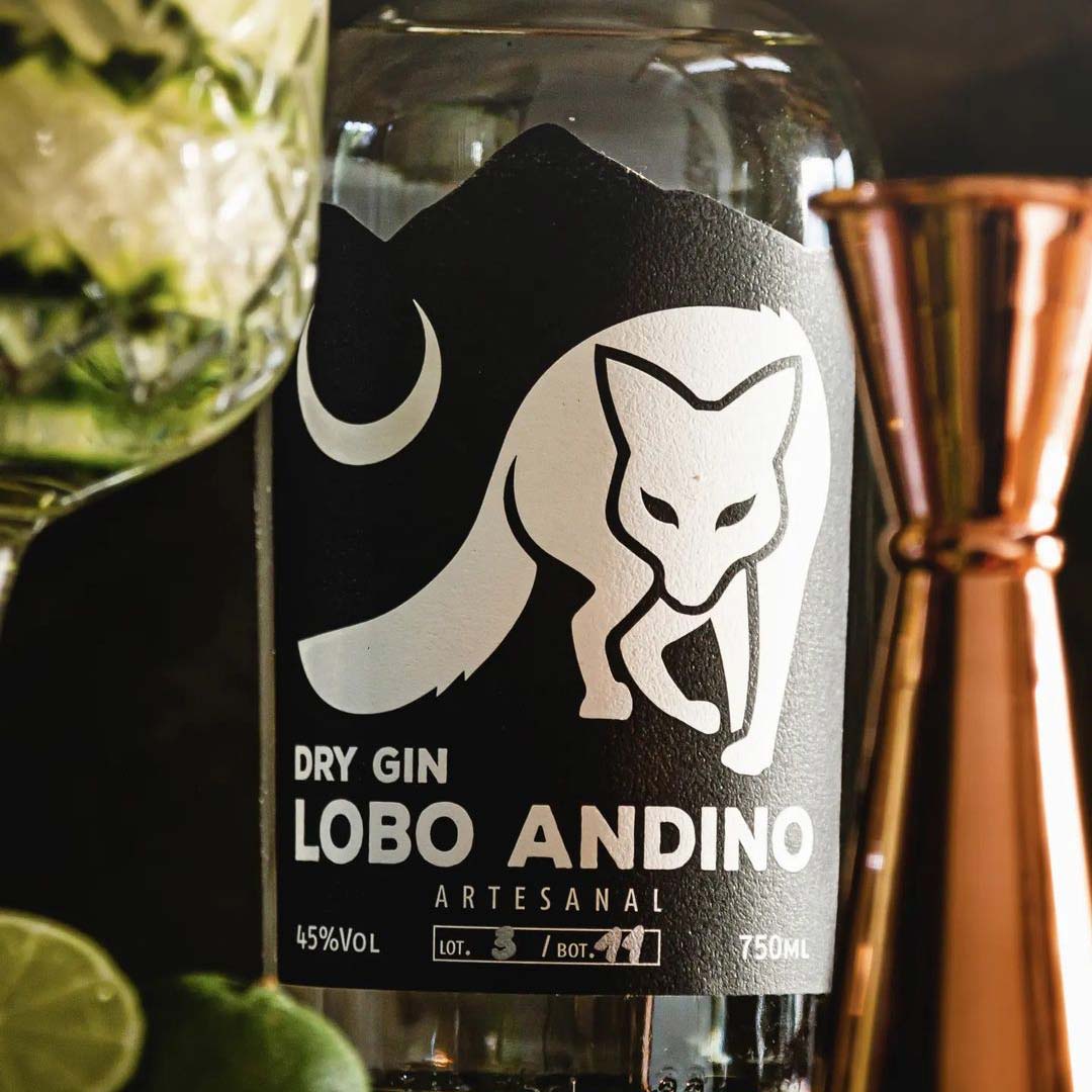
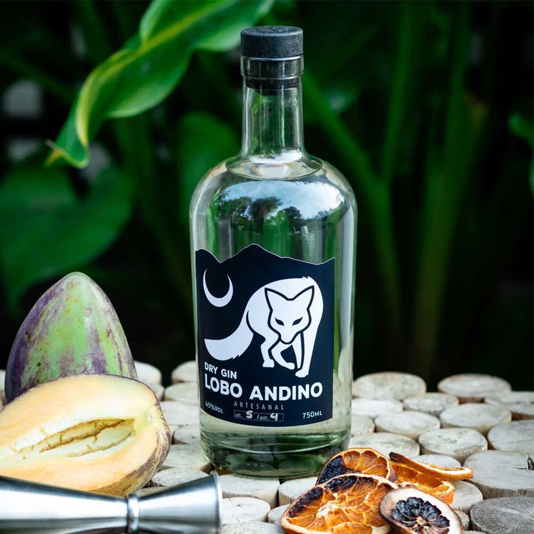
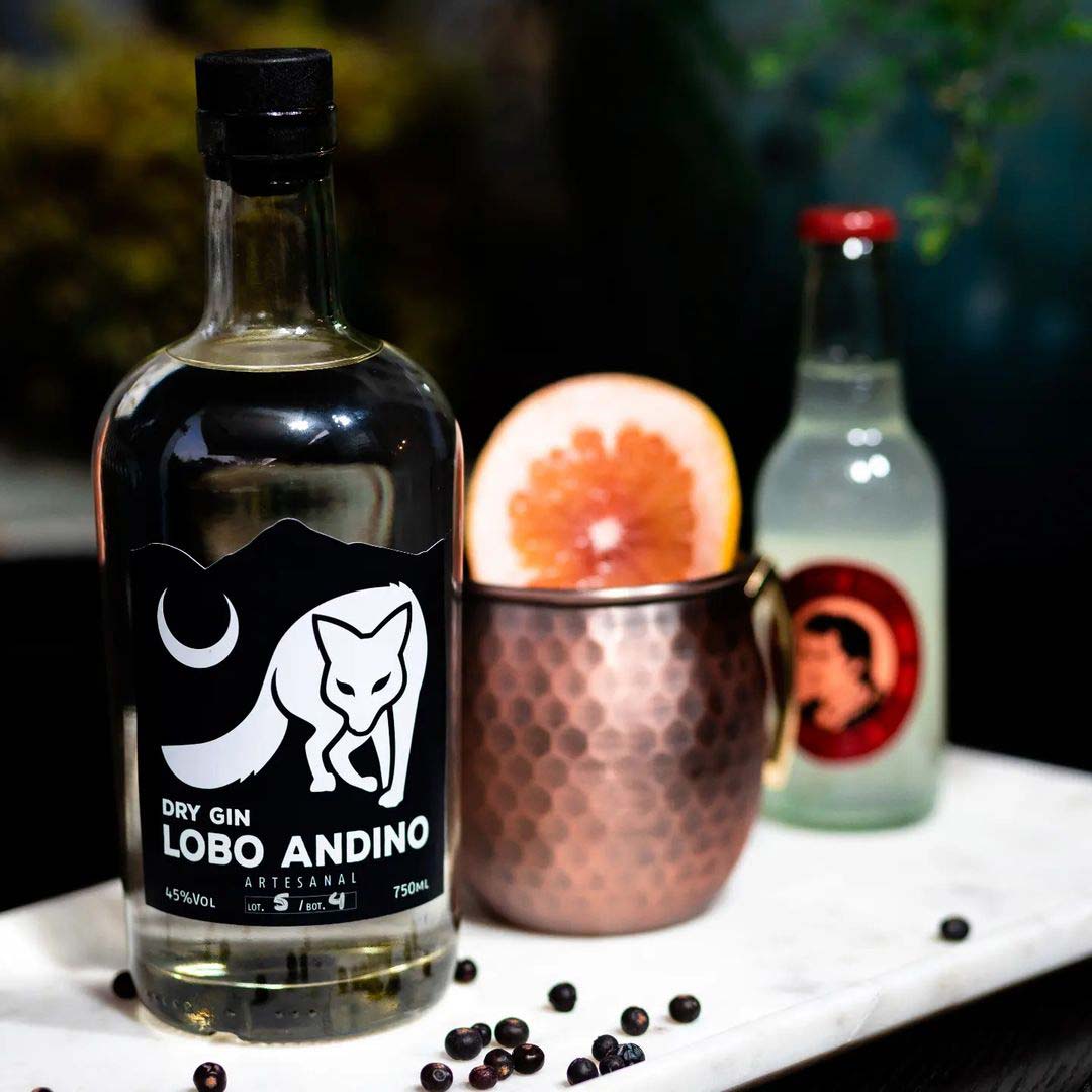
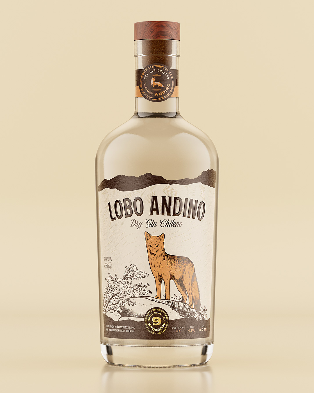
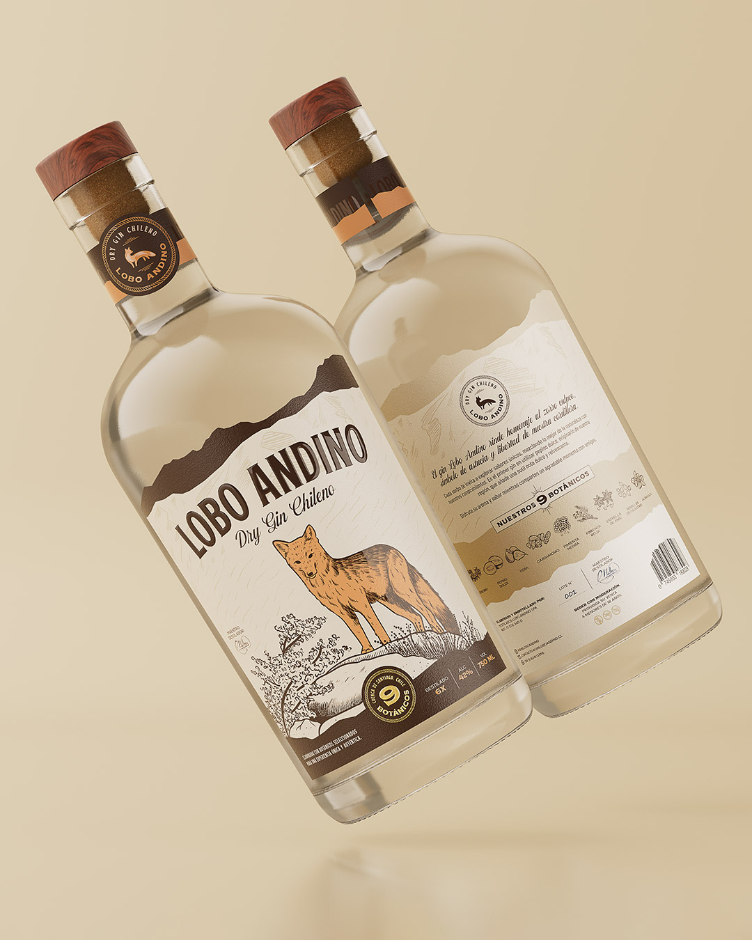
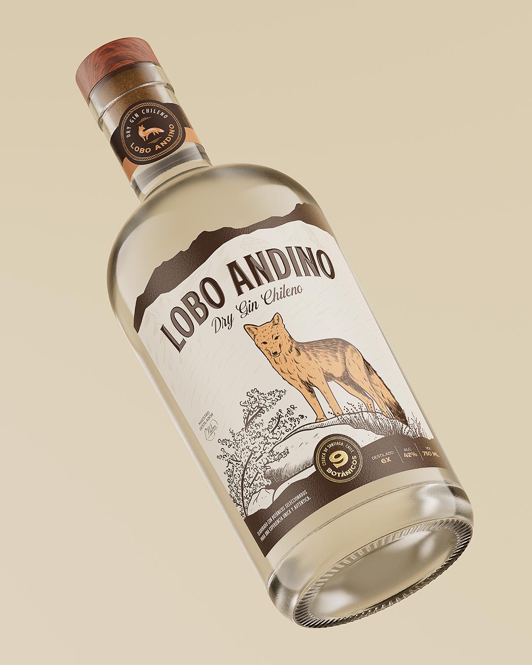
One of the positive aspects that we wanted to keep from the previous label was the cut in the shape of mountains. Continuing with the same idea to preserve its essence, a new cut was created based on the Santiago mountains.

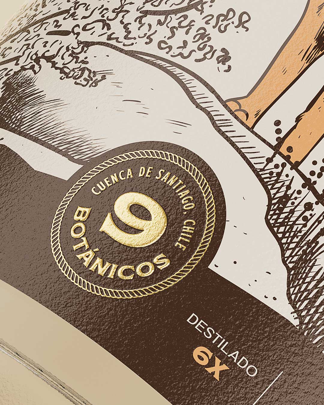
The visual of the labels is the result of the whole process of the project. On the front label, the culpeo fox is the main character. While the different levels of information are presented through the brand name, the amount of botanicals and other additional details.
On the other hand, the back label follows a similar visual system to maintain coherence throughout the graphic identity. It highlights the illustrations of the botanicals and the characteristics of the beverage at the moment of tasting.
Technical information
Client: Lobo Andino Gin
Location: Santiago, Chile
Graphic design and project management: Mariano Zanotti
Research, analysis and strategy: Alejandra Nucci
Illustrations: Damian Modena
3D modeling: Janderson Oliveira